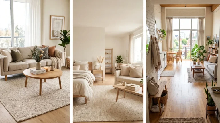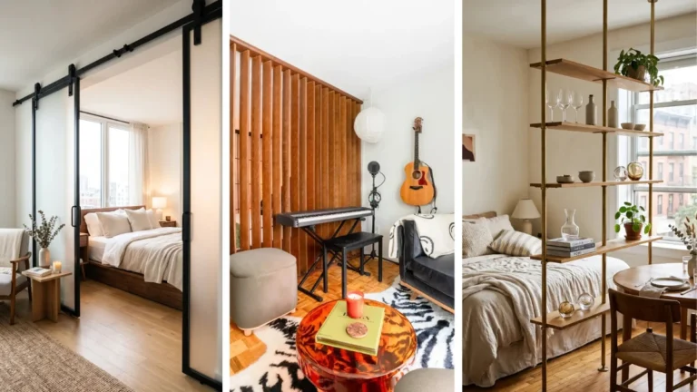
Living in a single room can be tricky when your bed, sofa, and dining table share the same floor plan. Many renters struggle with blocked walkways, cluttered corners, and tight pathways without understanding why the room feels so chaotic. Most of the time, the problem is not a lack of actual square footage. The real culprit is how the furniture is arranged.
Making a few common studio apartment layout mistakes can cut off natural light and make everyday living frustrating. You might think pushing every item flat against the wall creates more open space, or that scatter rugs help divide your zones. In reality, these habits chop up your sightlines and leave you dodging table legs all day.
The good news is that you do not need a bigger apartment to get an open, comfortable layout. Shifting a few key pieces and opening up your traffic flow will instantly free up usable space. Here are seven simple layout changes that will help your studio feel balanced, functional, and surprisingly spacious.
1. Centering the Bed Without Defined Zones
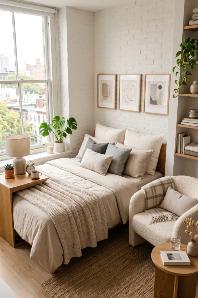
Bed-in-the-middle layouts are a massive trap in single-room living. Placing your bed smack in the center of the room might seem logical for access, but it swallows up your primary floor space. This layout choice leaves you with awkward, unusable slivers of space along the walls.
Tucking the bed into a corner or aligning it to one wall immediately frees up a continuous path for movement. This simple shift creates room for a distinct living area, protecting your studio apartment layout mistakes from making the space feel like a crowded dorm room.
⚠️ Watch Out
Avoid “island beds” in studios under 500 square feet. Unless you have a massive loft, pushing the bed to a corner or back wall is essential to reclaim your walking paths.
2. Blocking Natural Light with Heavy Dividers
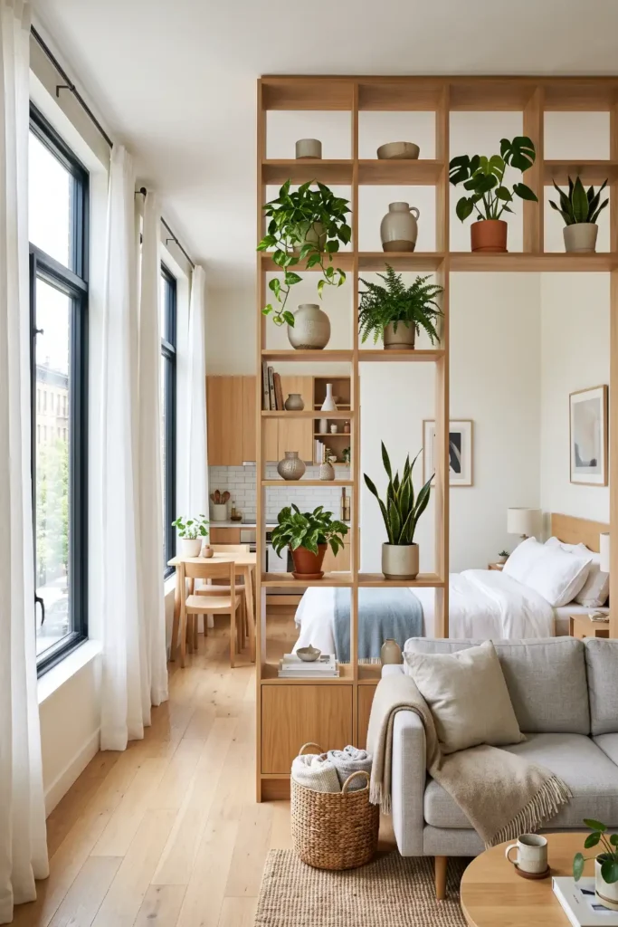
High bookshelf units seem like the ultimate privacy solution for sleeping areas. However, heavy solid furniture blocks light paths and cuts off sightlines.
- ▸ Tall dividers stop natural light from reaching the back of the room.
- ▸ Visual sightlines are cut short, making the ceiling feel lower.
Instead of solid bookshelves, try low-profile consoles or sheer ceiling-mounted curtains. Keeping light flowing from your only window is the easiest way to make a tiny layout feel open and airy.
Use open-back shelving units to let daylight filter through.
Hang airy, semi-sheer linen panels to partition space.
Avoid solid wood wardrobes as dividers in dark corners.
Do not use dark folding screens that swallow up incoming light.
3. Squeezing in Oversized Living Room Furniture
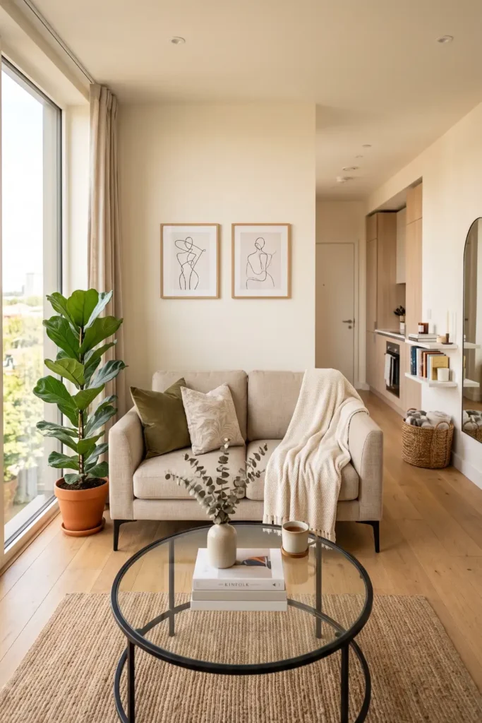
Buying a deep, three-seater sofa eats up your primary walkway before you even unpack your kitchen boxes. Scale is everything when you are working with limited square footage.
A sleek loveseat, a slender apartment sofa, or a pair of low-profile lounge chairs will keep the layout highly functional. They leave breathing room around your furniture, preventing that cramped, squeezed-in feeling.
| Bulky Living Pieces (Avoid) | Studio-Scale Swaps (Choose) |
|---|---|
| Deep, high-armed 3-seater sofas | Sleek, low-profile loveseats or futons |
| Heavy, solid wood coffee tables | C-tables, nesting tables, or glass tops |
| Overstuffed recliner armchairs | Slender, open-legged accent chairs |
4. Pushing Every Single Piece Against the Walls
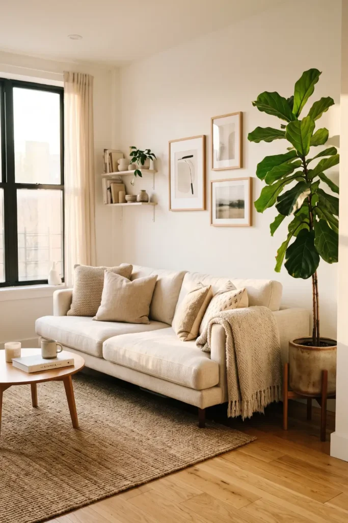
Hugging the perimeter with your furniture is an instinctive response to a small room, but it often backfires. Lining everything up along the walls creates a cold, empty center zone that actually highlights how small the room is.
By pulling a desk, dining table, or your couch just a few inches away from the wall, you create instant depth. Even a tiny gap allows shadows to fall behind the furniture, tricking the eye into seeing more room than there actually is.
5. Over-relying on Footprint-Heavy Floor Storage
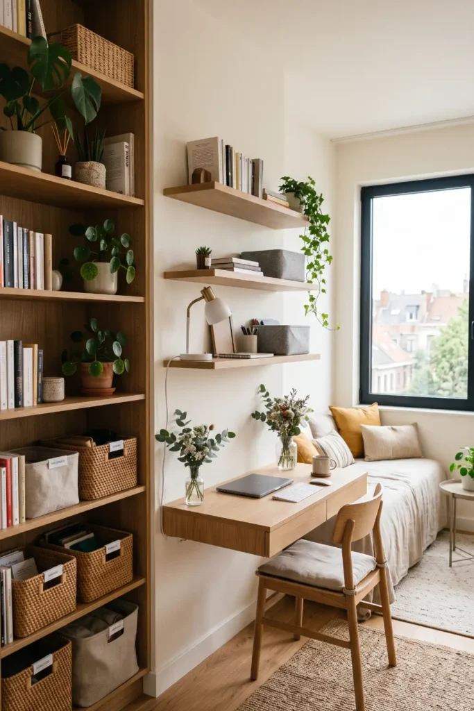
Low, wide dressers are a common storage choice, but they are a massive waste of precious floor space in a tight studio layout. When floor space is at a premium, you simply cannot afford to have wide furniture pieces taking up walking paths.
Instead of wide chests of drawers, utilize your vertical space. Tall wardrobes, wall-mounted floating shelves, and over-the-door storage keep your floor clear. Choosing height over width draws the eyes upward, making your studio feel much taller than it is.
Reclaim your floor space:
6. Scattering Multiple Tiny Rugs to Define Areas
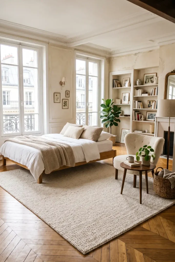
Trying to zone your studio with three or four small rugs usually backfires. The visual clutter of multiple rug borders breaks up the floor, making it look like a disjointed patchwork quilt.
This layout mistake forces your eyes to stop at every boundary, which shrinks the room. Opting for one large, cohesive area rug to anchor the main living area unifies the space and gives the illusion of a much larger floor plan.
One large rug under your sofa and bed visually expands the floor, while small rugs slice the room into tiny, cluttered pieces.
7. Placing the Entryway Directly Against the Bed
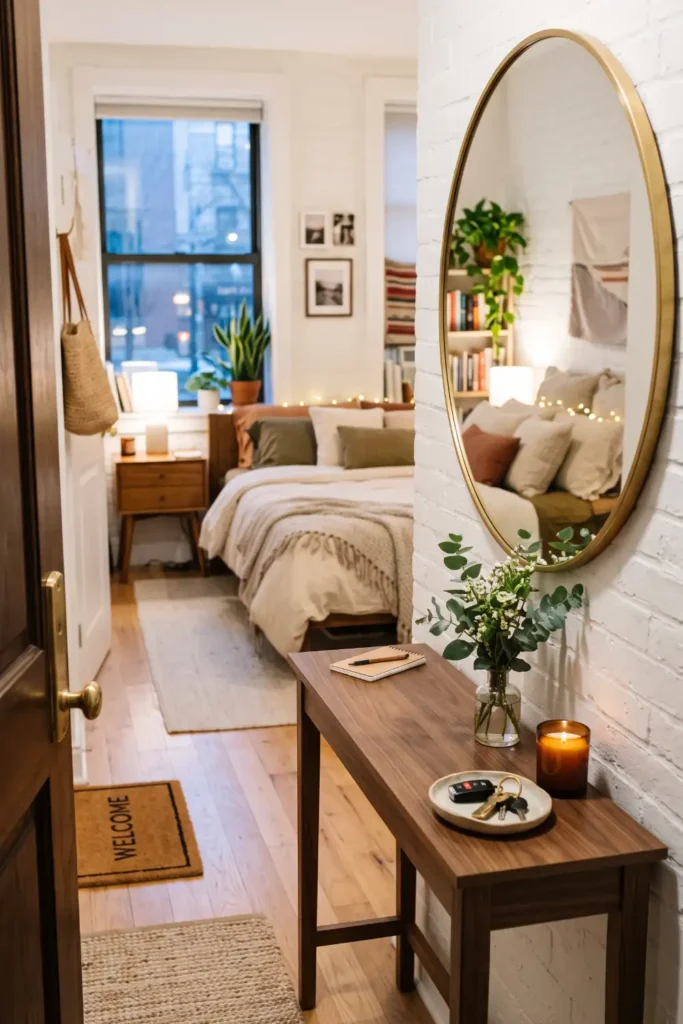
Walking straight through the front door into your sleeping area can feel incredibly chaotic. Without a designated transition zone, your sleeping area loses its privacy and feels exposed.
You can easily fix this by creating a faux entryway. Placing a small console table, a slim shoe cabinet, or a wall-mounted mirror next to the door blocks the direct view of your bed, keeping your sleeping zone private and cozy.
Conclusion
Making a single-room layout feel open and comfortable comes down to clear walkways and smart zones. You do not need to buy an entirely new furniture set to see a big difference in how your room feels. Start by adjusting your largest items first. Tuck your bed into a quieter corner, swap wide floor dressers for tall vertical shelving, and anchor your primary seating zone with a single large area rug. These small changes take the chaos out of daily living and give your studio the breathing room it needs.
Save this guide to your Pinterest home decor boards so you have these layout tips ready the next time you rearrange your space.